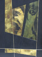
The latest offerings in the box project include a healthy dose of graphic lettering as part of the design, in boxes for Gone with the wind, and one that houses some personal letters of Margaret Mitchell, and runes used for Tolkien.
When I first started in 2006, I found that the more graphic the cover, the easier I found it to design a cover, especially if the design centered around graphic lettering.The lettering was simply copied, enlarged, and featured prominently across the cover.Maybe 30-40, have been made that way.
Now, however, I feel that the easiest covers to design are those which leave your options open, and don't dictate direction by an overpowering cover.
...more to follow, including instructions on how to use plates when tooling onlays...


