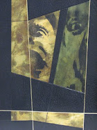
......AKA the Spaghetti method - good for use when you find yourself in a tightspot.In the case of "Child Of God", "A" thought the face was too scary, so I resolved to fragment it somehow, tool over the top.
So....
Directions :
1. Make numerous templates for cover,

drawing in spine.
2.Make colour copies of given material or designs to
be featured, or onlaid.
3.Complete as many covers as possible withing a given time frame
(in this case denise and I gave ourselves 3 hours..)
I also tooled some of the lines in foil, so you could see them better.
This should put yourself in a better position to envisage a final result, and choose which sketch or idea to persue, and or develop.
Any input from any of you out there would be welcomed, but "A" has the final say!!
Its like throwing a bowl of spaghetti against the wall, and seeing which strand is going to stick!!
Sketches are numbered 1-7 in the bottom right..comments welcome, but a decision will be made tuesday latest regardless.
*I missed off some of the no.s but it should be pretty easy to tell how it goes......


8 comments:
These are very powerful images.
My Favorites are number 1 and 2.
Scary by compelling
I`m definately leaning to no.1
I would say no.3... no.1 is still scary... actually they are all terrifying. go back to the original block cut.
I'm all for #5. You asked...
-A
comprimise?
No. 1 is really strong.
Also like the spine of No. 2.
too scary mate..don`t like the crosses...
number 1+5
6
Post a Comment