Saturday, October 20, 2012

box challenge - still going


yes ive been away from desk as it werefor quite some time........but work in the bindery has not stopped...
here are some of latest ...having fun with the stylus tool!

more later

Wednesday, May 23, 2012

Alaska.....the new PDB apprentice

Alaska McFadden started as the 2012 PDB apprentice, and in the first few weeks is already making an impact......A book Artist in her own rite aleady, she runs A Wrecked Tangle Press in Brooklyn with colleague Jessica Elsaesser.
Alaska is already proven to be a great asset to the bindery, and you can follow her progress at her blog :

anything with a spine

check it out and see what she's up to....

blog hiatus over soon...too many irons in the fire...more boxes...plus part 2 of the new york book fair....i know but the books are worth the wait.......

Wrecks divide...Tangles bind....quite!

Tuesday, May 1, 2012

New York Book Fair - parte deux


This will be a first for the PDB blog as I join the mile high club as it were posting as I am from 30,000 feet in the air over cowboy country, Texas. It is amazing the things technology affords us to do.
Please enjoy these French Book binding gems from the fair.............

parte deux...........

It wasnt all ancient manuscripts, incunabular, iconography and brass ornaments at the fair.


Modern design binding and book art, aswell as fine print were surprisingly well represented.
A real highlight for me was coming face-to-face with a fine number of french art-deco bindings, know only to me by thumbing through the pages of my copy of Alastair Duncan’s “art deco and art nouveau bookbindings".
There were pockets of modern french bookbinding from those periods throughout the many booths, but there was a heavy concentration in the booth of Dr.Fluhmann from Zurich. The good Dr. had some stunning and famous bindings from both the art nouveau and deco periods.

The two amazing bonets on display were immediately recognisable, and would jump out at any bookbinder. The size, the characteristic gold tooling, yes all that , and the fact that you’ve studied them in books for a long time...nothing beats seeing one in person. Some lucky person snapped up Bonet's binding of "FLORILEGE DES AMOURS"  that night for 25,000...a bargain! I congratulated the Dr. and he was assured that it had found a good home.....nae bother! as they say up north because he still had at least 2 more fine Bonet's, yet another spectacular binding with onlays, a very precisely completed gold work naturally, and studded with mother of pearl- “Bubu de montpartnasse by Charles Louis Phillipe”. 
The pieces of shell I have used in the past were rather thin, these were a good thickness, so i can appreciate the difficulty of cutting such exacting shapes.

The affable Dr’s collection was just getting started ......there were more bonets that were on display - most of which was instantly recogniseable to anyone who has studied french bookbinding from that period.
A very familiar binding by Francois Louis Schmied (les climats) with effortless gold tooling with each impression and line completed without any discernable deviation in heat pressure or dwell....a typical design mapped out using half circles, and intersected straight lines giving that characteristic schematic and architectural look that is so pleasing and familiar in almost all objects from that period.
The binding opposite by Francois Louis Schmied,  demonstrated a willingness to break from the more tradtional format...using appliques and surface gilding and colouring, The precision of the inlaid veneer was evident and of course impressive, but this binding was more notable for the abscence of a rigid architectural pattern. The calf skin was immaculate, not a scratch or a dimple in it!
The rest of the bindings on display struggled to compete for attention in Dr.fluhmann’s comparatively modest cases, but were no less interesting or famous for that matter. 


The art Nouveau bindings are distinct....the colours are darker, the designs much more figurative, often using floral patterns of onlays and tooling , though not always. This style was evident in an art nouveau style binding of Goethe’s Faust Charles Meunier. Instantly recognisable again, not least for the planed boards and cut-relief leather work.....techniques I covered at school when doing medieval binding...and have seldom used since.
Next to that was a copy of Faust bound much more to my taste by Bonet..great leather work, and tooling, and of course the powerful dot-tooled pattern work. You can see the wonderful large grain of the moroccan skin, sadly no longer around.
The Dr’s modest booth was made up of 2 cases housing a little over ten bindings, small and Qto sized, all of them stunners, all of them significant bindings from an important period of bookbinding, all of them historically significant pieces of art.


The fair was huge, wall to wall booths from dealers all over the world, with just an absolute cocophony of books and art, and you would have to go far to find more great french bookbinding from that period and later.


French dealer Jean-Baptiste de Proyart brought along a large and fine collection of books. Now its probably the Philistine in me but i am a sucker for larger bindings...i guess there is just more of it to love....never truer when facing Pierre-Lucien Martin’s binding of Stephanie Mallarme’s “Un coup de des jamais n’abolira le hasard” .
The design is so simple and maybe that’s why I like it so much...it appears to be an alphabet of handletters cut in outline, so that the letter can be tooled and an onlay placed within the outline and tooled again... definately envious of the handletters.


I suppose that by now we have been spoiled so much that we barely even notice the rather modest bindings by Jean de Gonet on the shelf below...three diminuitive bindings all in a row showing the characteristic 3-phase binding, sectioned hollow, and exposed sewing. One stood out from the others in that it appeared the leather covering material at the spine seemed to be made up using strips of a skin weaved together??!!


Jean Baptiste also had another work by Stephanie Mallarme, bound by Bonet, which was very pleasant, and easy on the eye.....an embarrassment of riches by this time really..


One more then, by another famous french binder known for his adept finishing ...Henri Creutzevault..


The Brick Row Book Shop brought this very famous binding of “Le Grand Testament” by Francoys Villon bound by french binder Lucie Weill in 1948.
Again, although there was definately more historical bookbinding at the fair than anything else, there was a great deal of interesting finds and modern binding work, and we have barely scuffed the veneer.


Up next ...well bindings from Douglas Cockerell of course, not one , but 2 kelmscott Chaucers...and some great stuff from pirages, bromers, etc...etc...

descending over the Poconos on a sunny day....

the better part of leaving New York,  is coming home.

Sunday, April 15, 2012

Park Avenue Armory 2012 - part 1


There really was too much to cover at this year's 52nd new york antiquarian book fair at the park avenue armory, so that as i visited on 3 seperate occassions over the weekend, this post really has to be splitt in to parts also.


Among a truly embarrassment of riches of religous and secular literature, there were distinctive pocket of book arts, modern design bindings, modern art, and my favourite, the art deco bindings of F.L.Schmied, Pierre Legrain, Paul Bonet et al.

But for now we will just have to content ourselves with the opulent and ancient religious manuscripts and incunabular, rennaisance bindings, anatomical text books, a very fine copy of Erasmus, Slavic gospels in solid brass bindings, and a rather interesting laced and tacketed account book.

When i walked in, your bookbinding senses suffer a complete overload...best to just pick a side and travel. If you went left like i did the first booth you would come across was Dr.Joern Guenther's from Zurich Switzerland.

In the middle you can clearly see a classic example, among many, of a rennaisance binding covered in red velvet, and to the right a smaller illuminated gospel of st.paul, by simon Master c.1150-75, who according to the card,

"was known to have illuminated books for Abott of Simon of St.albans.....The manuscript is extremely close to the group of glossed manuscripts made for Thomas Becket...."

In almost every case there were examples of hand illuminated manuscripts from throughout the medieval and rennaisance periods, of all shapes, all sizes, each unique, in a variety of bindings...some with clasps, some in leather, some with brass boss's. The standouts for me were the few later  secular texts mixed into the soup of handcoloured and illuminated gospels and multiple "book of hours".

One of which was a first edition german translation of versalius' "de humani de corporis fabrica libri septem." The card read


"...one of the most influencial works in western medicine. Versalius(1514-1564)was appointed physician to Charles V. He is regarded as the father of modern ideas on anatomy."


Quite!...and this was the first booth!

I complemented Dr. Joern Guenther on his showcased bindings, and professed a certain naive incredulity as to how you would come by such historical bindings as a private collector. I asked when he started collecting, and he answered that his interest in books began at 14 and he has continued to collect for 40 years. Of course it doesn't hurt to be in the continent such work was completed, but when further pressed on where he came by them, he was suitably vague "private collectors...."


                        .......................................................................................................................


Ursus books was one of another booths that seemed to be overflowing with historically significant illuminated manuscripts and binding.

One standout was the slavic bible from the 17th century, with brass covers that were etched with illustrations.


Another notable addition at the Ursus was the use of I-pads to display different pages of the illuminated manuscripts ...pretty smart juxtaposition of technologies...


                ..................................................................................................................................


Gregarious Bookseller  Rudolphe Chamonal from Paris had a few historical gems too - an early edition of Champier, french Humanist published in lyons,  1508. What was notable about this binding was that  the velvet used was pink, but it has faded to beige.


                 ................................................................................................................................


A trip over to James Cummings of New York would bring you face to face with a copy of Erasmus' Aldine adagia c.1508, bound in pigskin on double-cords and wooden boards, a translation of latin proverbs.

"in the land of the blind, the one eyed man is king"

etc.........


             ............................................................................................................................................


 Wrapping up the third day brought more discovery in historical binding, when touring with binder Christine Giard and my friend and book expert "a", we chanced upon an early contemporary binding of an account book for a jewish family of financeers. The binding is referred to as "laced and tacketed", and we were very lucky that both Chela Metzger and the bookseller at Musinsky Rare Books of New York, were fortunately on hand to help bring a greater understanding of the context, value, and construction of the book.


All together 3-4 days was nowhere near long enough to get a full experience from the show, and required quite a bit of photo editing aswell.

In the following posts, bindings from the 19th century aswell as modern design bindings, some book art, some modern art, and art deco celebrities like legrain, bonet and schmied will all require seperate posting..


next ...art deco bindings


Wednesday, March 28, 2012

PDB Apprenticeship program


The incomparable Faith Hale has spent the last year in the bindery with me, and it has been a great experience for both of us.

Faith, after a year, is continuing her education in the field of book arts enrolled on an MFA course at Mills college.

I will be sorry to see her go, and will miss her fastidious efforts for learning of course, but more than that I will miss her continually upbeat vivacity, and good humour which are always necessary qualities at PDB.

The position was advertised on the various lists and of course our facebook page, and I am pleased to announce that Alaska L.McFadden will be PDB's next participant in the program. Alaska is a graduate from Pratt university, and a talented book artist in her own right, operating A Wrecked Tangle Press with Jessica Elsaesser, and having her work already exhibited in a number of national institutions.

You can see her work at....

www.awreckedtanglepress.com

design work including back pared onlay demos are imminent.......

Sunday, February 5, 2012

The Box Challenge - Huey P. Long


Robert Penn Warren's book follows the career of fictional character, populist governor Willie Stark's rise to power, and inevitable corruption and fall.

‎"If you were living in louisiana you knew you were living in history defining itself before your eyes and you knew you were not seeing a half-drunk hick buffoon performing an old routine, but witnessing a drama which was a version of the world's drama and the drama of history too: the old drama of power and ethics."   RPW


Although he insists his book is not about politics or any politician in particular, his character Stark, is a mirror image of louisana's real and corrupt populist governor Huey P. Long.


Huey Long, began his career as a traveling sales man, selling amongst other remedys for varied ailments,  a liquid evacuant  called "black draught", still available today.


To the working poor he would remain a hero for providing schools, work, bridges and roads, for whole sections of louisiana's poorest communities, but to the richest and most powerful american's he was a scourge and by others still, like notable historian Arthur Schlesinger, he was the closest any american politician would come to a dictator.

Read more of his history here

Ken burns has a pretty good documentary about him too, which includes an interview with Robert Penn Warren about Long, or you can watch Broderick Crawford(1949), or Sean Penn(2006) deliver Stark's famous treatise on  "dirt".

Stencilled and dyed onlays of Long in characteristic full flow, yellow dot tooling.

Monday, January 23, 2012

William Morris - 'nuff said


Its not often that you will get to see a Kelmscott edition, and when you come across one you are sure to remember, no doubt through a mystic haze. I'm sure every binder has a story or two detailing their discovery of a Kelmscott edition, me included.
So I was happy when a dealer and friend brought in Morris' edition of Beowulf.
Immediately recognisable are the decorative initials and marginalia, the intertwinning floral designs printed from woodblocks. The lettering is a characteristic medieval gothic, and the paper a rich white and well preserved.
The binding is not up to much really, cant see the benefit of pasting down ends onto a limp vellum cover, as you can see.
I remembering studying Beowulf at the beginning of a very short lived career as a student of English in North Wales....couldn't handle the anglo-saxon, but then, what did I know....


William Morris...'nuff said......

Friday, January 13, 2012

The bonefolder 2012 R.I.P


It was with mixed feelings that Peter Verheyen informed me that while a recent article I had written on my work was included in the latest "bonefolder" online magazine, it would actually be the last issue.
There are some 14 issues, covering many aspects of bookbinding, and with many how-to demos from notable book artists like Tim Ely.
I am downloading each issue and will be rebinding them for inclusion in the PDB reference library.
Who knows what will come next to take it's place.

The last issue includes an article written by yours truly "A Bookbinder's Gamble", chronicling the last 6 years of "The Box Challenge", aswell as some other great articles.

get it here


Tuesday, December 27, 2011

basic techniques for printing on goatskin


This post first appeared on the DBOA blog earlier this year, I am reposting it for the members of this blog.


Out of necessity in 2008-09, I worked hard on transforming the regular goatskin onlays I was using to decorate my boxes. I had already been working on the boxes for 3 years, and after completing a lot of regular tooled onlays, I needed to start using new techniques in order to keep the work fresh, and keep both myself and the client interested. I had done some stamped onlays, but limited the use of these for children's books, and other volumes that had distinct jacket designs. As in the set of C.S. Lewis, and boxes like the signed first edition of Camus' La Peste. However, I tend to avoid the use of plates where possible, for although they do save time and make the design process easier, they can give a box a generic machine made look. I had done lacunose on a box a few times, but that can be time consuming, and certainly not efficient when working on an edition. I needed a more inventive, artistic method to transfer an image onto goatskin, or to find new ways to work or transform the onlays.

It was with this in mind that I began printing on goatskin, by first carving images into blocks of wood. I took some fair goat, dyed it, inked up the blocks, and pressed them onto the pre-pared skins. The first question was, "should I pare the skins first or after printing?". The next issue to overcome was the exact method of pressing in the studio, without the use of either a table-top adana, or any other hand-cranked letterpress machine, which I would later employ to great effect.

I experimented at first with hand techniques similar to those used in Japanese wood-block printing, but found it difficult to get enough pressure. Lastly, resorting to the use of a nipping press. You can get good results using a nipping press, but it requires a deft touch. The problem with using a nipping press is that all the pressure is exerted on all points of the block at the same time, which can lead to bad bleeding. Using a cylinder is much more preferable for this reason, although even with a cylinder press its possible to bleed an image with either too much ink, or too much pressure. If you are going to try this yourself, care must be taken not to smudge away the image while pasting onto the surface. The method of pressing, and the fact that the onlay is already pared to 0.10 microns, means that the image tends to be more delicate.

I used this method quite well in Cormac Mcarthy's "Child Of God, and Budd Schulberg's"Waterfront", and some others, however having had some success with rudimentary printing on goat, decided it warranted using more complex methods.

In the next development, I made regular polymer plates (Box-Car Press), for use on a hand-cranked Vandercook cylinder press. By"regular", I mean a plate that has a positive and negative printable area. Images from distinctive jacket designs were relayed to the plate maker. With the help of friend and print artist Mindy Beloff (Intima Press)we set them up on her Vandercook. I brought both pared fair goat, and un-pared goat, and it became clear right away that we were going to get much better results more easily with the unpared goat. I need not have been concerned about the paring, as with enough skill and enough sharp blades, onlays could be comfortably pared down to .10 - 0.12 microns on the scharfix without stretching and distorting the images...mind you, it doesnt hurt to have a few spares!!!

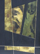
The next step was to see if the half-tone polymer plates I had used in the reproduction of some famous civil war photography for the endpapers of a binding of Walt Whitman's "Wrenching Times", which I was working on in 2009, would print well enough on goatskin. They did, heres a tip - ink up the plate 5-6 times before rolling over the with the goat. The results were very impressive, and a long way from the rudimentary wood block printed onlays. The half-tone plate works using a seires of small dots allowing for a variety of tones in the image, much the way older printing technologies have worked. What about running the skins throught the scharfix. No problem!, again no stretch, but always advisable to have spares. It is still possible to rub the ink off by over pasting the onlays, and if the onlay is too thin, so caution must always be heeded, but the onlays were much more stable than the wood block printed onlays of before.


This technique provided me with opportunity to transform the images, whether by dyeing, distorting, tooling. Its a good way to add an element to a design without too much hand tooling, but using photography printed by half-tone on goatskin can get old very quickly, if its over used , or not used in combination with other techniques, or it is not essential to the overall atmosphere of the design. In the case of the binding of "Wrencing Times", the images used not only are some of the first ever photographs to be taken in history, and some of the most expressive and famous images of the civil war era, they go well with gaylord's wood engravings inside the book. The images though, have not been used without some element of transformation, ie , they have been deliberated distorted by colouring over them, in the hope of giving them more subtlety, and have been surrounded by broken surfaces of gold leaf, to give an atmosphere of a faded, empty, and perhaps forgotten glory.


The Latest method for printing on goatskin I have used (october 2011), is quick, easy, and very effective.

Photo-transfer, or off-set printing on animal skins for bookbinding is nothing new, but the methods I have used before in combination with acetone were in no way as effective as this last method. You do not need plates, a vandercook or proofing press, inks, or any other solvents. It is a very basic method, rudimentary, and possibly not the most tidy, or elegant method out there.....but it does work, and work well. Take an image, remembering to reverse it before printing on a high quality printer, or make a xerox copy - colour or black+white. Cover the image to be transfered with a layer of liquitex matte medium and press. If you are carfeull enough you should be able to remove the paper after drying using water and a piece of cotton. If you are too aggressive you can break the polymer bond, leaving craters, so take your time and do it in stages. This method is good for inlays or for parts of the cover that do not require movement...such as the joints and turn-ins.....as the surface will break, and so too the image....The images used for a box made for Woody Guthrie's own copy of "American Folksong", are over 12"x9" large, and the transfer is of a very good quality black and white, managing to capture all tones light to dark.

This last technique has great potential for making endpapers, doublures, or for use in covers as part of more complex collage work.


My experiments with printing on goatskin, and transforming goatskin in general will continue, and I'm sure there are many more techniques out there I could put to good use.

Monday, December 26, 2011

2012 - the year of the dragon


celebrating the coming year of the dragon with a new web site


all the best for 2012
g

Wednesday, October 26, 2011

The Box Challenge - Woody Guthrie

                                                                            
It seems appropriate timing given the current climate, that the last two of my designs dealt with Huey Long, the populist politician, and now Woody Guthrie, who once said famously when accused of being a red..."I dont know about any reds, but I been in the red all my life..."

Politics aside, it is becoming clear the last few years that the most valuable tool in the bindery, apart from the scharfix, has been the large lightbox, found on the street some years ago, close to our first shop in Chelsea. An unbelievable find thanks to PDB CEO Denise Dovey.

I use it to trace patterns and images to make stencils for airbrushing, patterns for tooling and onlaying, to prepare designs using printed goatskins, tracing designs onto templates, and also now, in the production of off-set printed goatskin, and photo-transfer.

Now photo-transfer is nothing new, I first did some at LCP a decade ago, using acetone - but I never got results like this. The latest discovery in printing on goatskin, is quick, easy, and effective...and you dont need to use any plates, you dont need a vandercook, or any toxic chemicals. Its not a new technique, but it works well for goatskin, and has unlimited possibilities when it comes to constructing a cover design based on collage and used with other techniques.

The photo on the front board is from the LOC digital archive, and a famous picture taken possibly by Dorothea Lange(not sure), blown up, cropped, and manipulated in photoshop - sharpening contrast and exposure will ensure a good print. The photo on the back is taken from the opening shot of Steinbeck's "Grapes of Wrath" which I found fitting to use considering Woody's song about Tom Joad, included in the book "American Folksong", the box for which houses Guthrie's own copy.(that's tom in the distance)When I think of American Folk in that era, I see baptists, hobos, blue jeans, riding the rails, windmills, dirt crossroads, and yes, clearly telegraph poles.

If I had been making this design for myself, I would have completed the design with rows of stormtrooper police, and sprayed anarchist signs all over it, giving it a topical and menacing look, a nod to Guthrie's own politics - "This machine kills fascists"....but its not, and I think using the pictures evokes Guthrie's era, and a sense of american folk, with a much more subtle flavour.

The box was finished with tooled outlines of images of Guthrie, which i decided to keep to the side, so as not to distract from the image. I also decided to just leave it there. It is lettered down the spine as it is a rather large and narrow box.

Friday, October 7, 2011

Boston GBW Standards

Denise and I are in Boston this weekend, with the rest of the bookbinding community.  Boston is hosting the Annual, Standards Seminar for the Guild of Bookworkers.   Various seminars, bindery tours, and  all our favorite bookbinding vendors in one city.  Registration is closed, but the vendor room is open to the public....see you at the

Boston Park Plaza hotel
50 Park Plaza,
Arlington st.

We shall be making a first visit to bBromer's Booksellers around the corner too